ShopDreamUp AI ArtDreamUp

Deviation Actions


Suggested Deviants


Suggested Collections


You Might Like…


Featured in Groups


Description
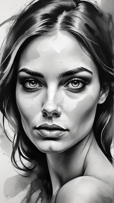
Digital drawing of Miranda Kerr
12 hours total work time.
for my new instagram account
follow me at : www.instagram.com/jifu_art/
full size downloadable
photoshop basic brushes + Water Splash Brush
Background (Water Surface)
:origin()/pre14/71cf/th/pre/i/2013/065/6/0/water_surface_texture_by_evelivesey-d2fnuf6.jpg)
by EveLivesey
12 hours total work time.
for my new instagram account
follow me at : www.instagram.com/jifu_art/
full size downloadable
photoshop basic brushes + Water Splash Brush
Background (Water Surface)
by EveLivesey
Image size
1600x1600px 312.33 KB
Date Taken
Dec 8, 2015, 12:00:00 PM
© 2015 - 2024 JoeDieBestie
Comments8
Join the community to add your comment. Already a deviant? Log In
You definitely have skill when it comes to drawing and shading a face, it really almost looks like a photo. At a glance, without looking at this for more than a minute this piece, overall, looks really good. Her face catches your attention, and the dynamic movement of the water is a great contrast to her pose, which creates a good composition, boosted by the great background. Your main problems though, are with the torso, particularly with her chest and arms. Her arms are scary thin (specifically the left one or Her right), I'm not sure if you were using a reference or not, but they kind of resemble the photoshopped models you see on like cosmo magazine, but hey maybe that's what you wanted, because they don't look bad. The chest though, is a problem area. I am assuming that the water that goes across her breasts is not acting like a bra of any sort, in which case, the highlight between her breasts would look different, and not as if she had cleavage (which only happens when wearing a bra, or if they are being pushed together/shoulders are forward rather than back really). Her breasts also look like they are supposed to be kind of towards the small side, which is great, but the shadow that is there wouldn't be so harsh. looking on the right side (her left) there is a shadow or line that kind of makes it look like she is standing at two different angles (easier seen when you cover up the bottom part of the picture from the tip of her middle finger down). The water adds some great movement, but in the areas where it goes under her arms, I'd suggest making it darker, so that it looks more like the water is actually moving around her. I really like the contrast of her hair compared with her skin and the background. These may not be things you're willing to change now, but it could help for future pieces.